Work/Cura
Cura · HFES mHealth App Competition · 2023–24
From guesswork
to a care plan.
Eczema flares feel random. We designed Cura so people can log symptoms, triggers and routines in a few taps, and walk into the doctor’s office with a clear report.
2ndplace, HFES mHealth
App Competition, Chicago
Problem
Eczema is unpredictable. Triggers are hard to pin down, people track in scattered notes and apps, and stigma makes it hard to talk about, even with a doctor.
Solution
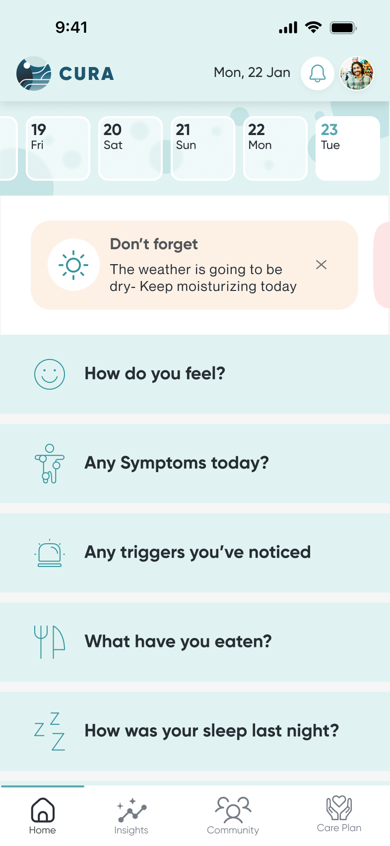
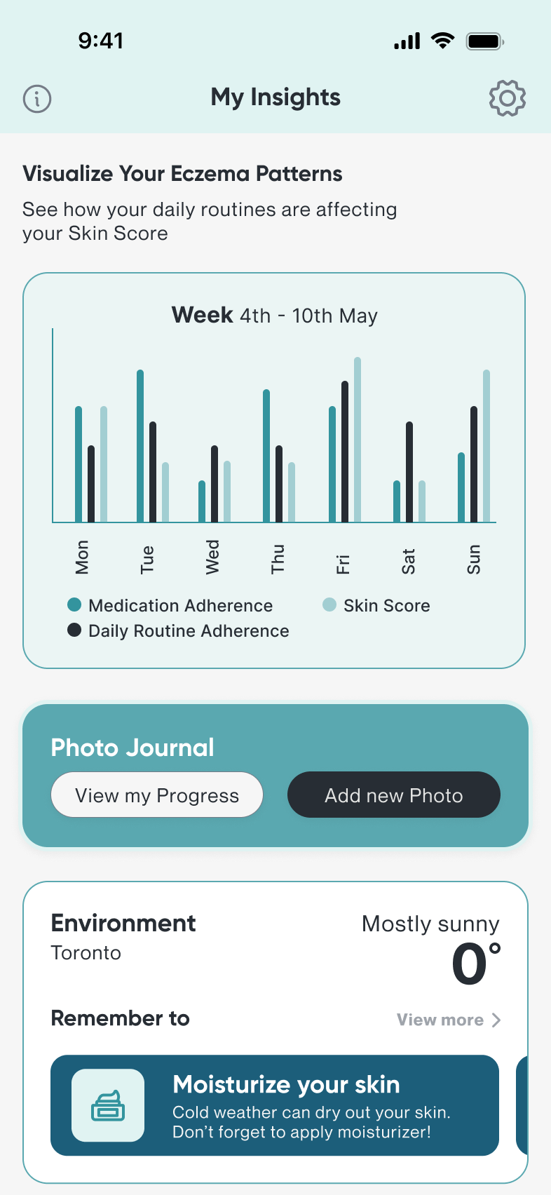
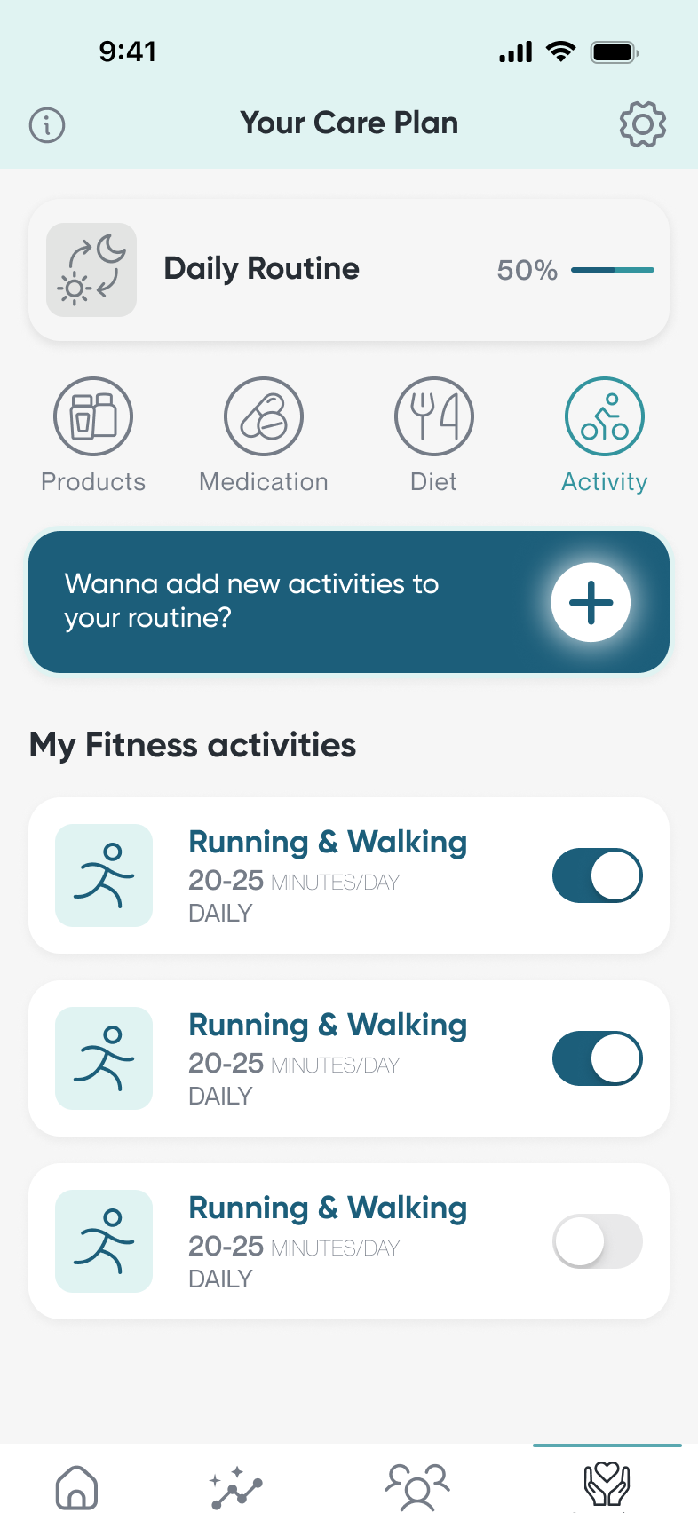
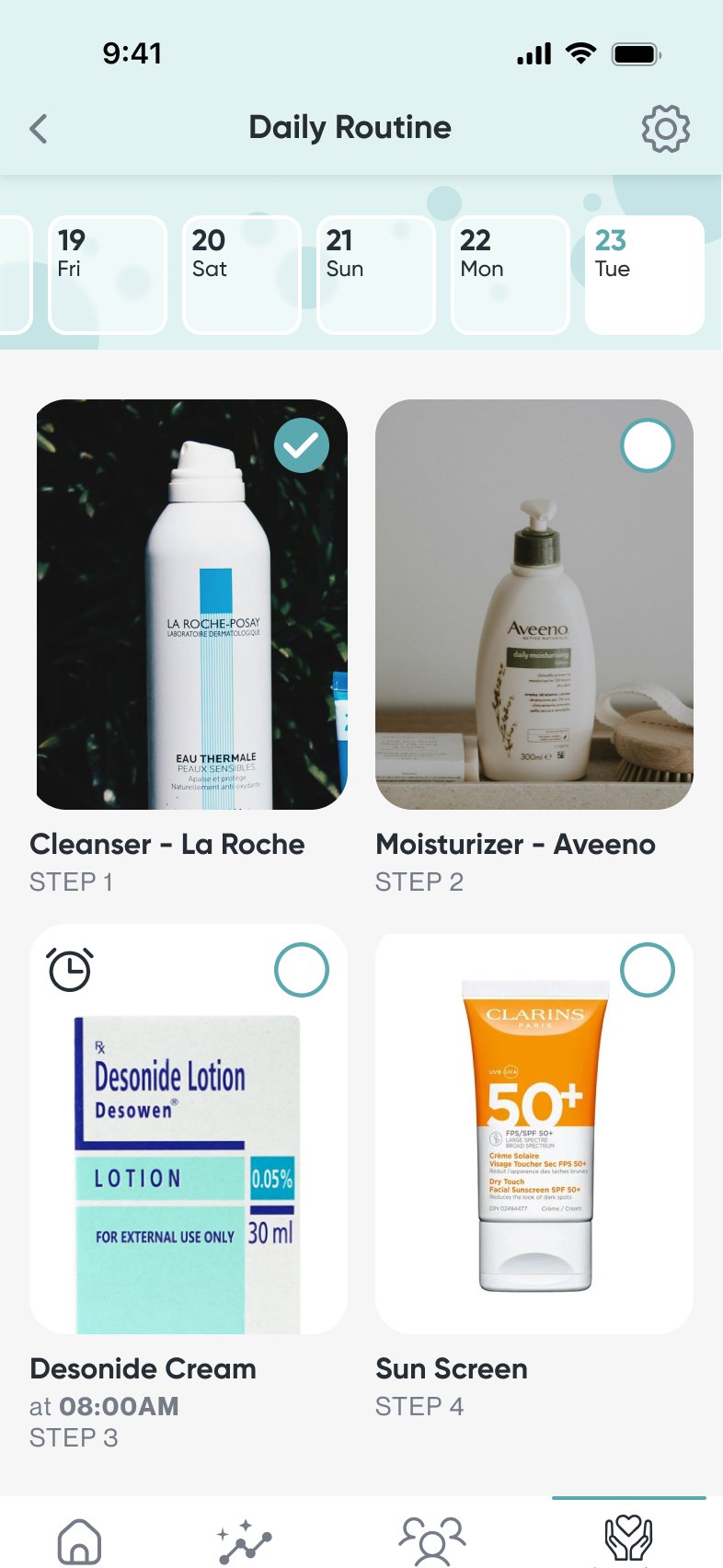
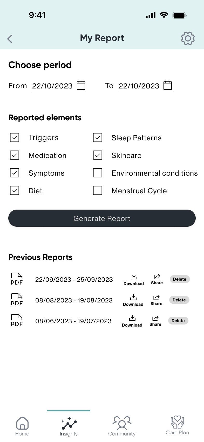
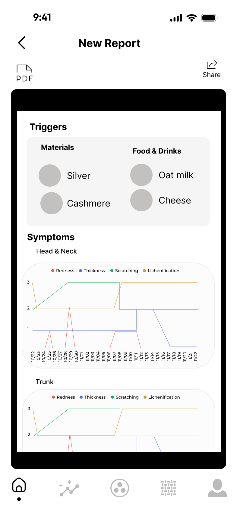
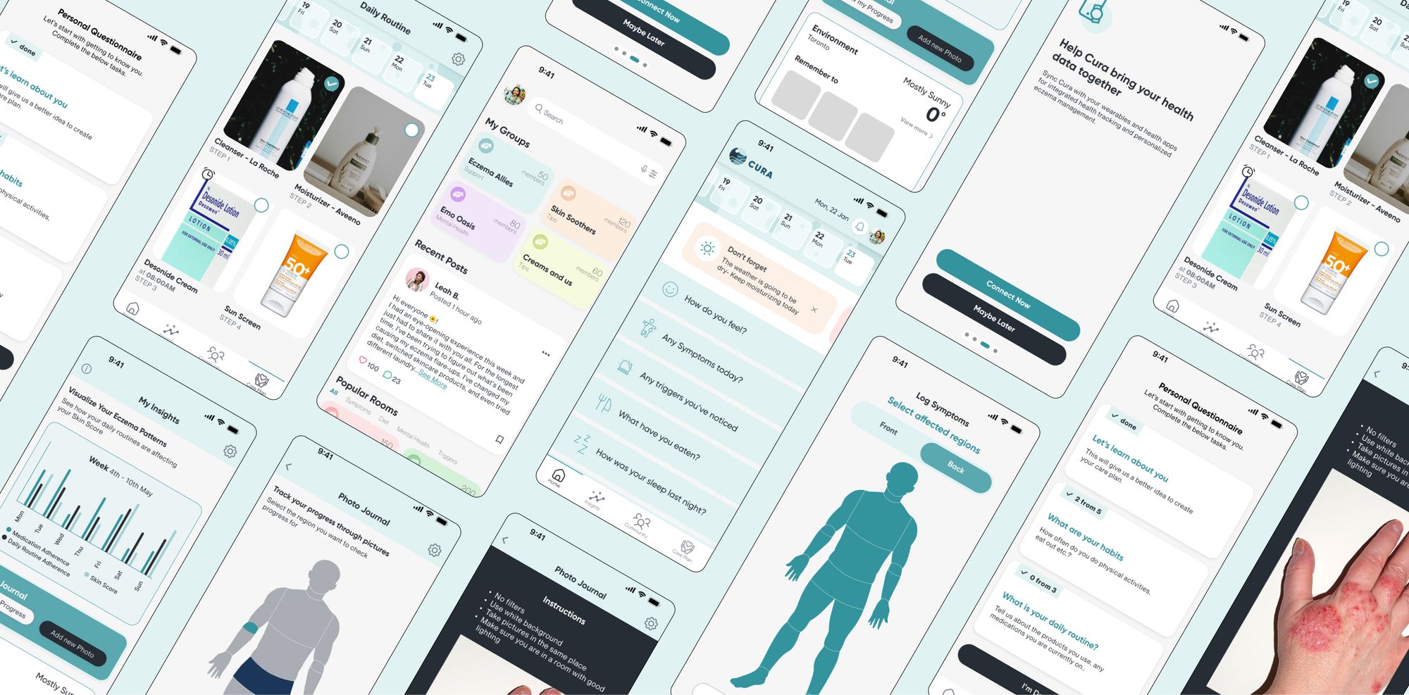
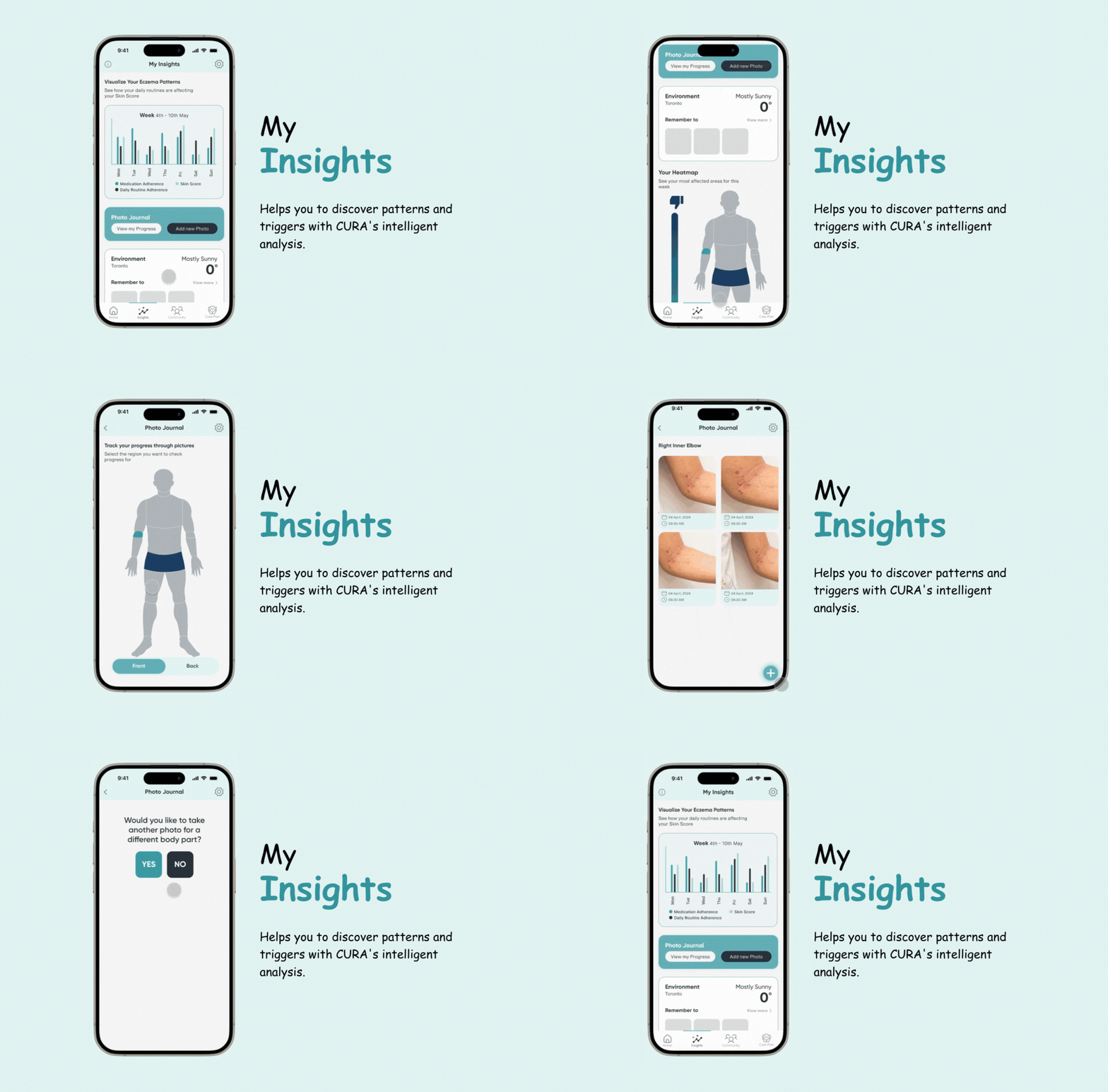
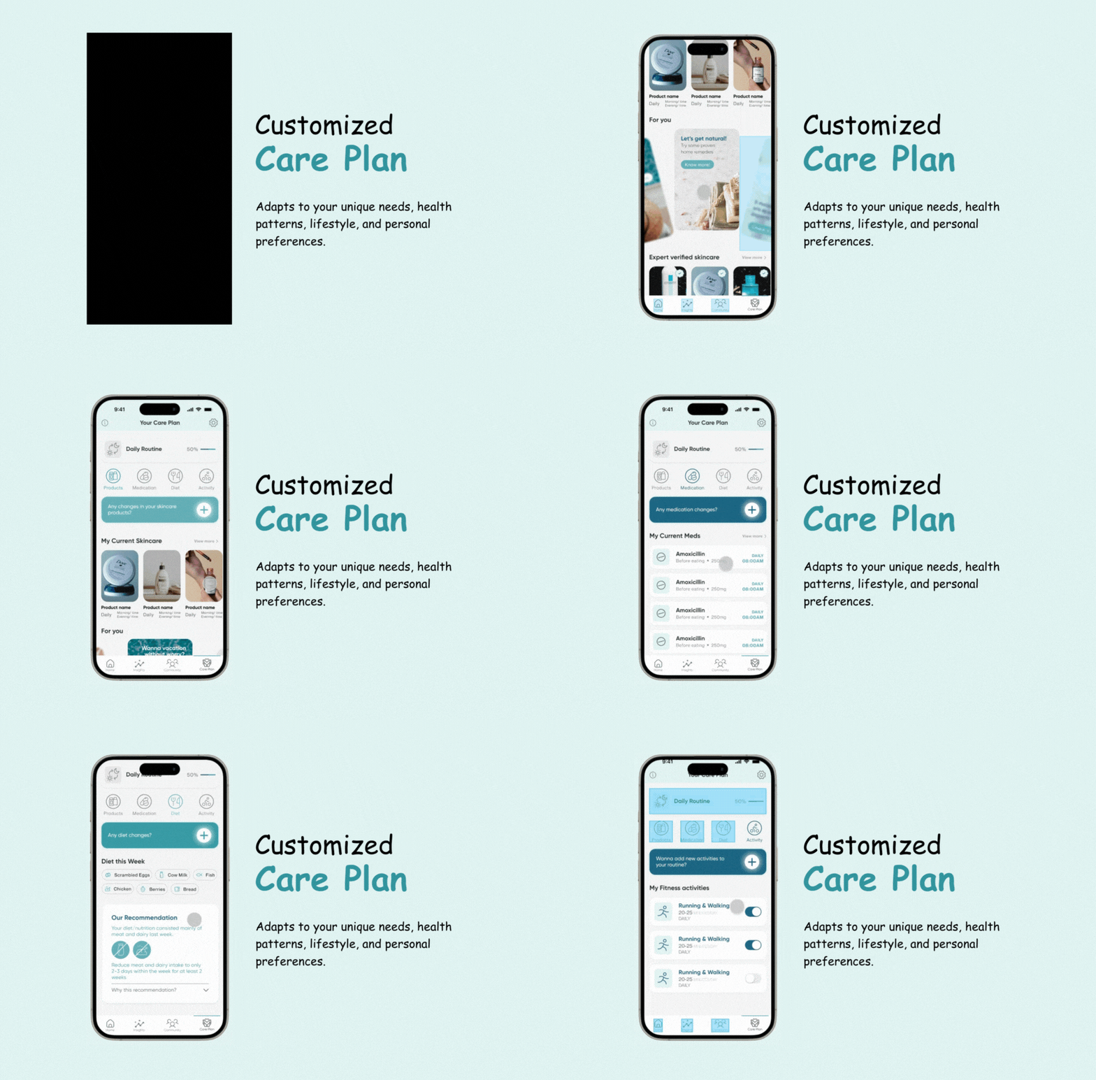
Cura, an app to log symptoms, triggers and daily routines. It spots patterns, alerts you when your condition worsens, builds a personalized care plan and shares easy-to-read reports with your doctor.
My role
Design research, product, visual and content design in a team of three: literature review, digital ethnography, flows, wireframes and two rounds of iteration with expert feedback.
- Team
- Nayanika Goje (UXR), Samiha Essakhi (UXE) and me
- Timeline
- Sep 2023 – Mar 2024
- Outcome
- Runner-up, HFES mHealth App Competition
- Tools
- Figma, Adobe Illustrator
01The moment
Your skin flares overnight. Was it the food, the stress, the weather, the new soap? Before anything else, you need one answer:
“What set it off?”
Eczema brings intense itch, redness and dry skin, and its unpredictable nature makes triggers and treatments hard to identify. It also carries psychological distress and social stigma that affect mental health and relationships.
We started with what was already known
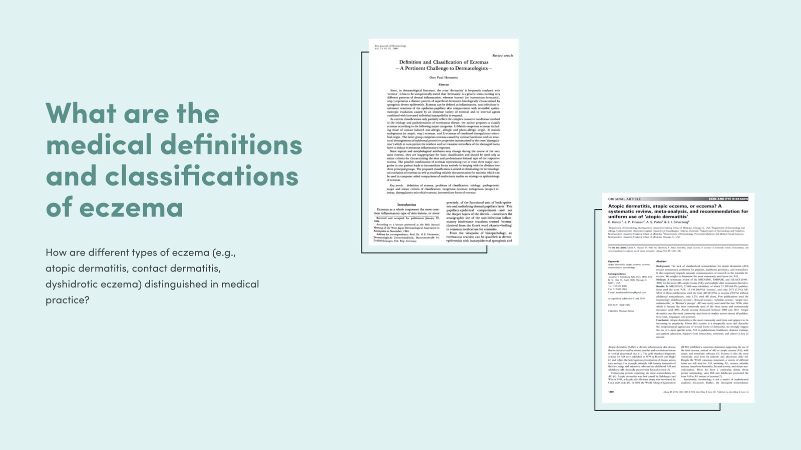
We chose eczema because of personal experience on our team. Before designing anything, we ran an extensive literature review on its causes, classifications, triggers and the current treatment landscape.
02What we heard
80 Reddit threads, three clear patterns
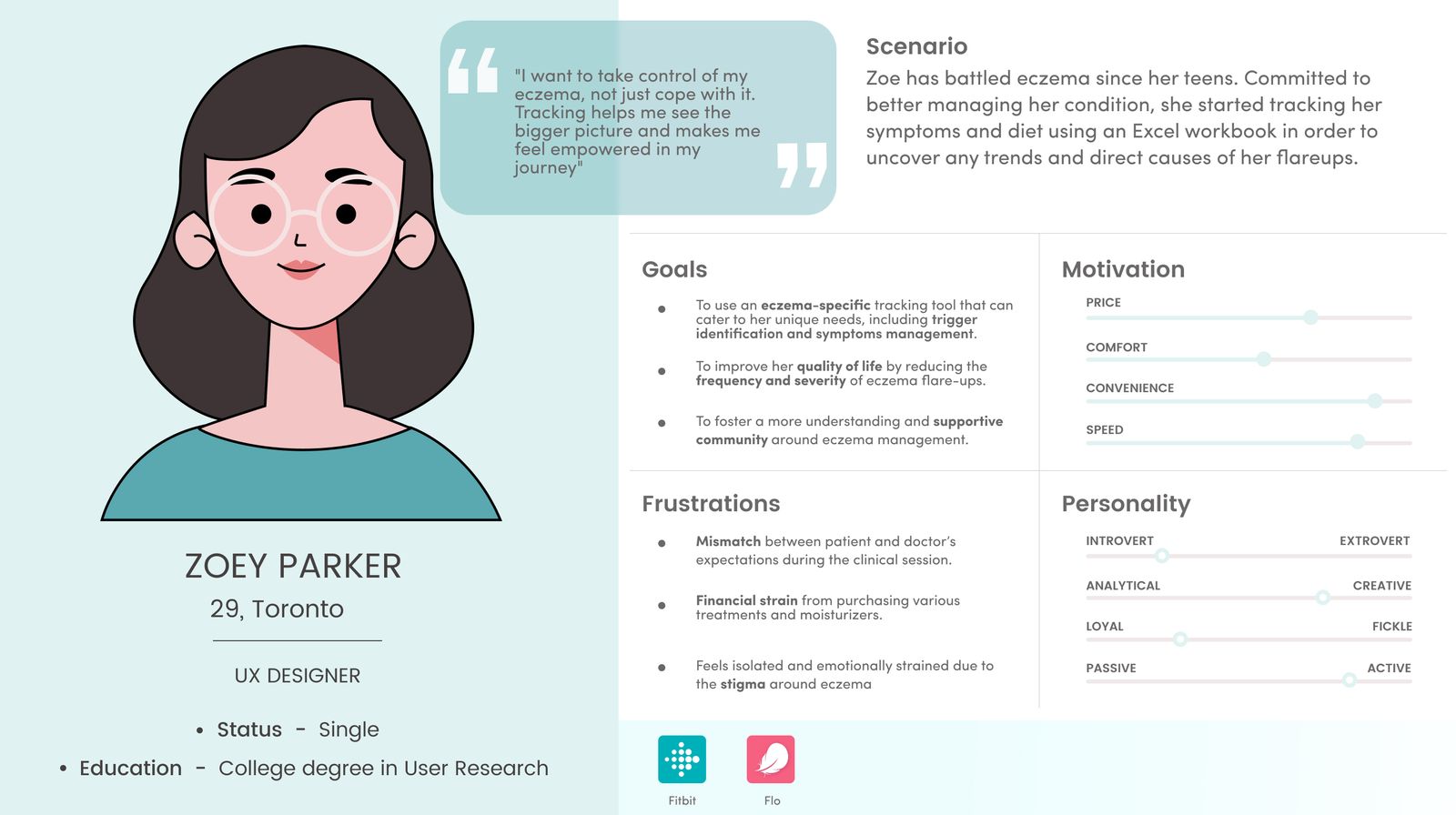
Without ethics approval for direct interviews, we used digital ethnography: social listening across Reddit, blogs and eczema sites, searching terms like “eczema tracking” and “eczema journey”, then coding 80 threads into themes.
- People patch their tracking together. They blend note-taking with apps built for something else, like a period tracker used to log sleep, medication and mood.Digital ethnography
- Stigma keeps people quiet. Users hesitate to talk openly about their condition, fearing judgment from others.Digital ethnography
- A detailed record is how triggers get found. A systematic history of exposures is crucial to managing the condition.Digital ethnography
So the question became
How might we help people with eczema manage it day to day, and talk to their doctors with confidence?
- Track related information, not just symptoms.
- Let people customize what they track.
- Show how things interact: sleep, food, stress and flares, together.
03The obstacle
We couldn’t talk to patients, so we brought in a doctor
Social listening told us how people feel about eczema, but not what a doctor needs to see during a visit. Our first wireframes tracked symptoms well and missed the clinical picture.
The turning point
A 45-minute call with a dermatologist reframed the app. Age shapes treatment. Stress and menstrual cycles are major triggers for women. Family history (asthma, allergies, rhinitis, eczema, dry skin) matters for diagnosis. Our guidelines, and our screens, changed to match.
04The redesign
Four changes, from a doctor and a heuristic review
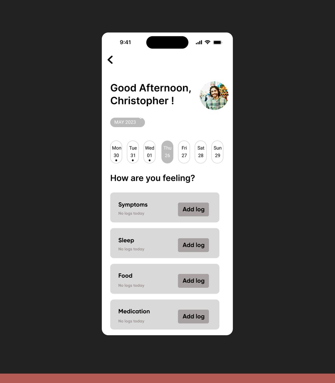
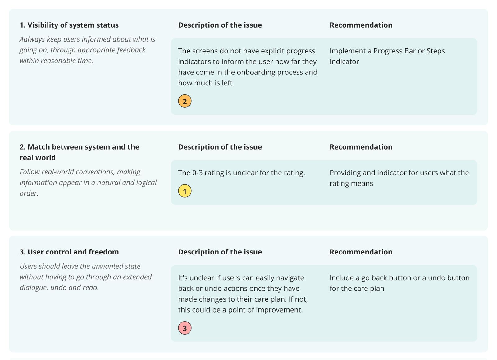
Iteration one came from the dermatologist; iteration two from a heuristic evaluation against Nielsen’s 10 heuristics. Flip between before and after.
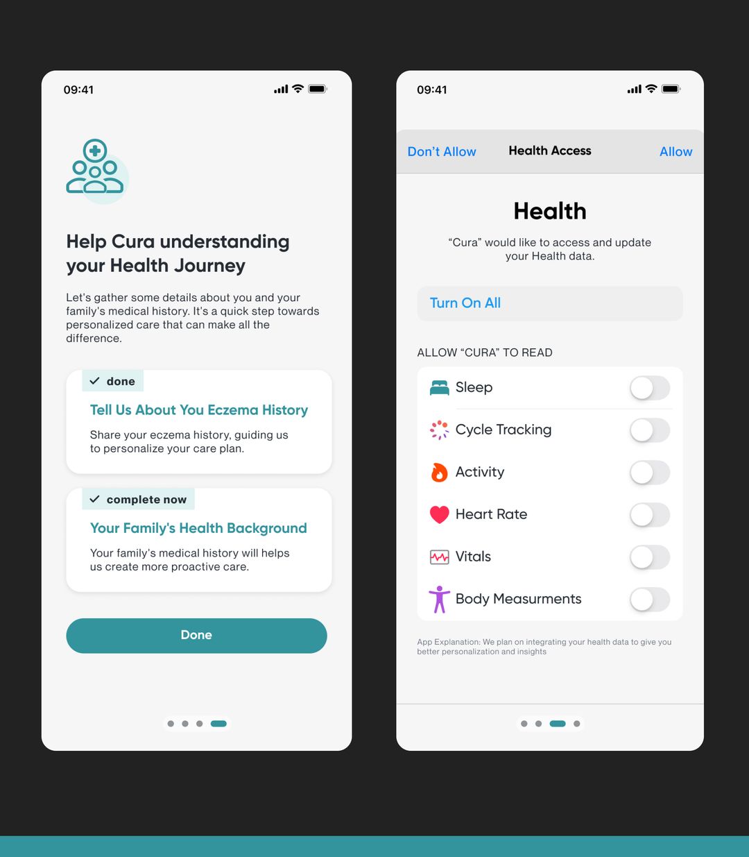
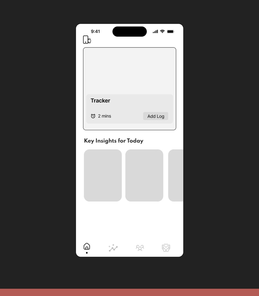
Health data beyond the skin
No way to track sleep, activity, heart rate, vitals, body measurements or menstrual cycles, as the dermatologist pointed out.
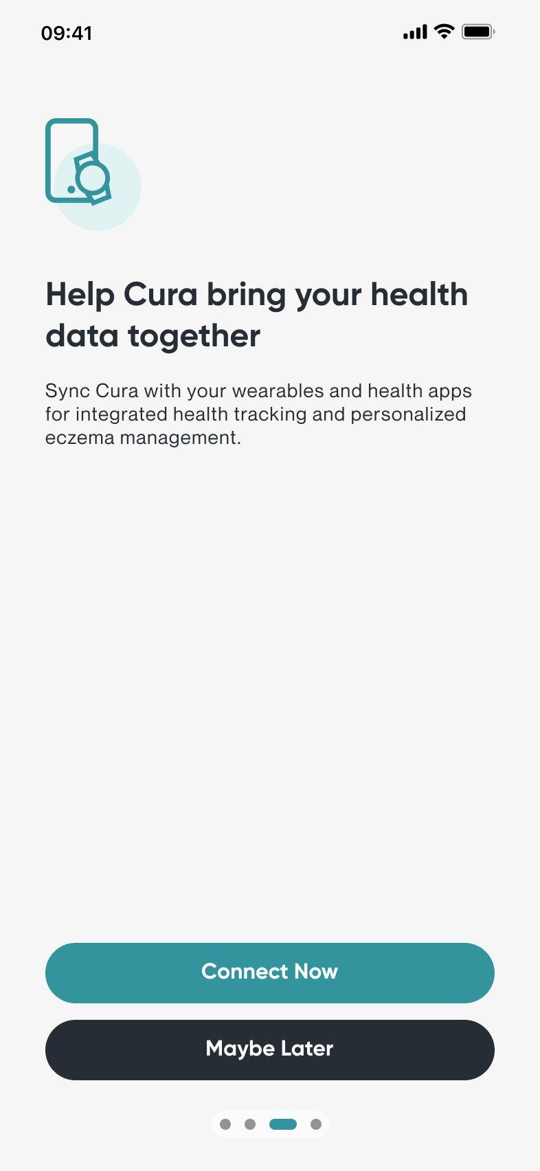
Onboarding now offers to sync wearables and track vital health metrics, for more personal insights.
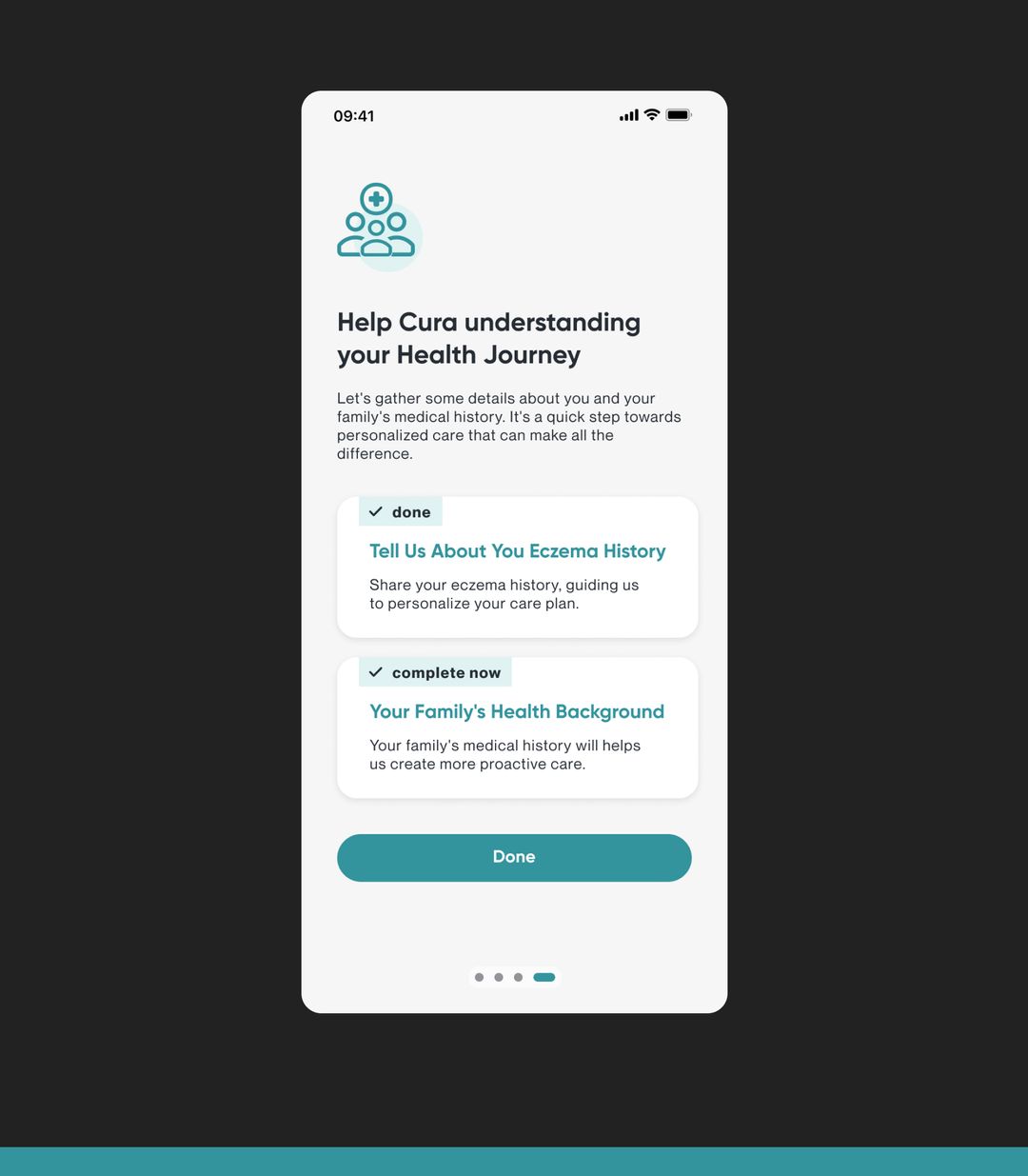
Age and family history, asked up front
The app never asked for age or family history, missing data needed to personalize care and spot hereditary patterns.
Onboarding collects age and family history, feeding personalization and better analytics.
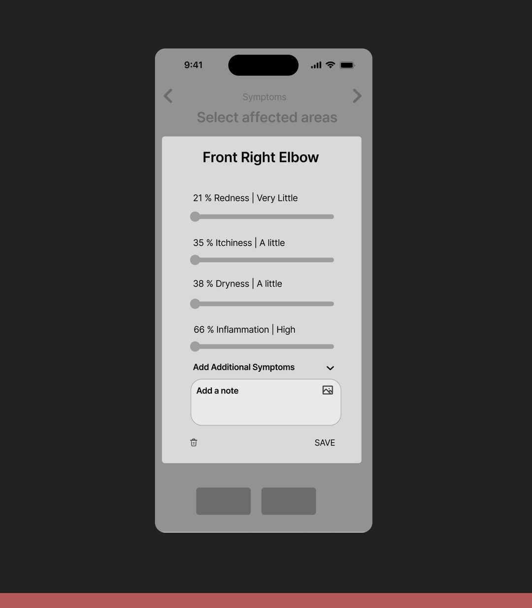
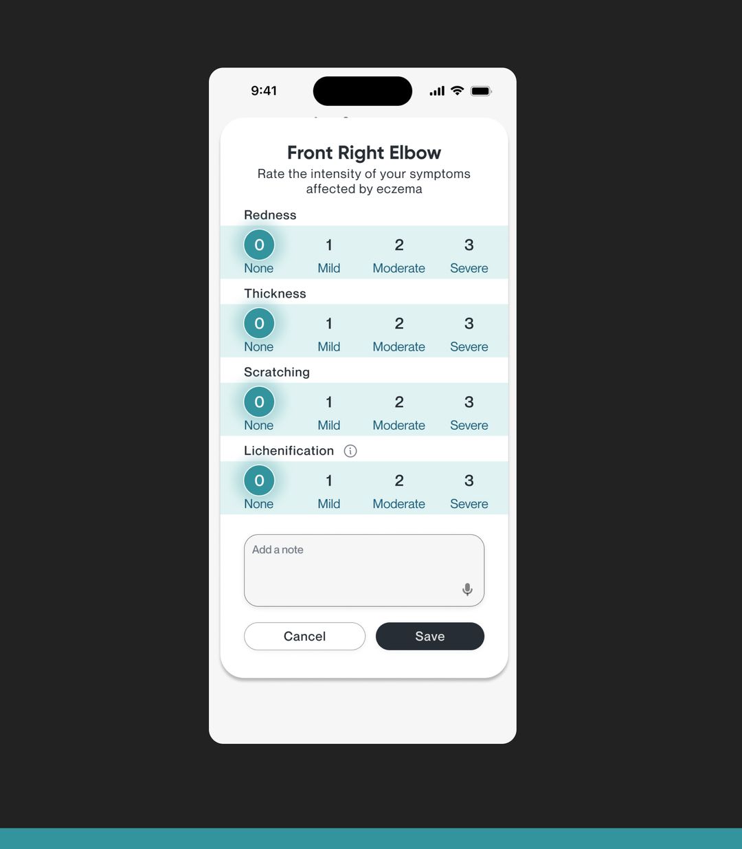
Severity on a simple scale
Complex sliders with qualitative descriptors made rating a symptom slow and ambiguous.
A straightforward numerical scale, one tap per symptom.
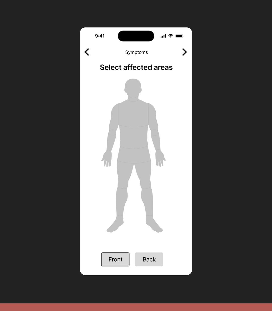
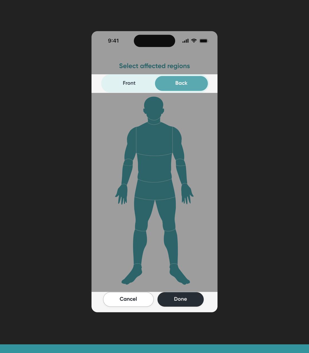
Buttons that say what they do
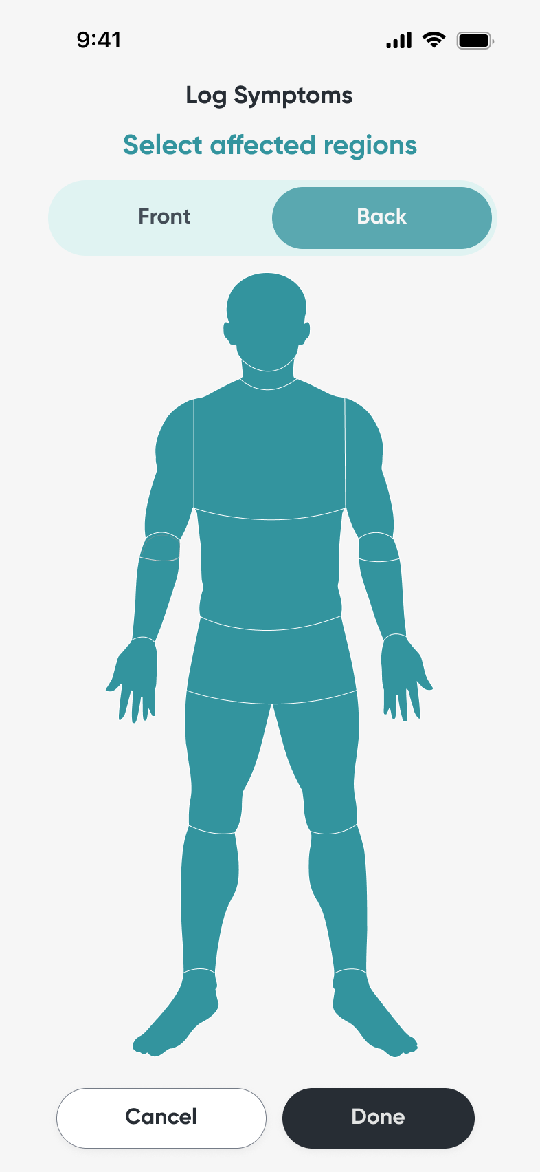
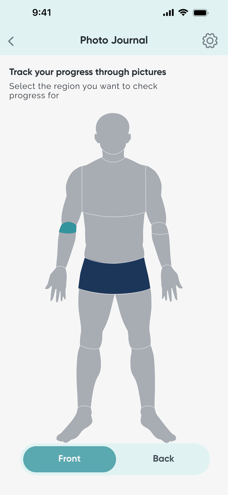
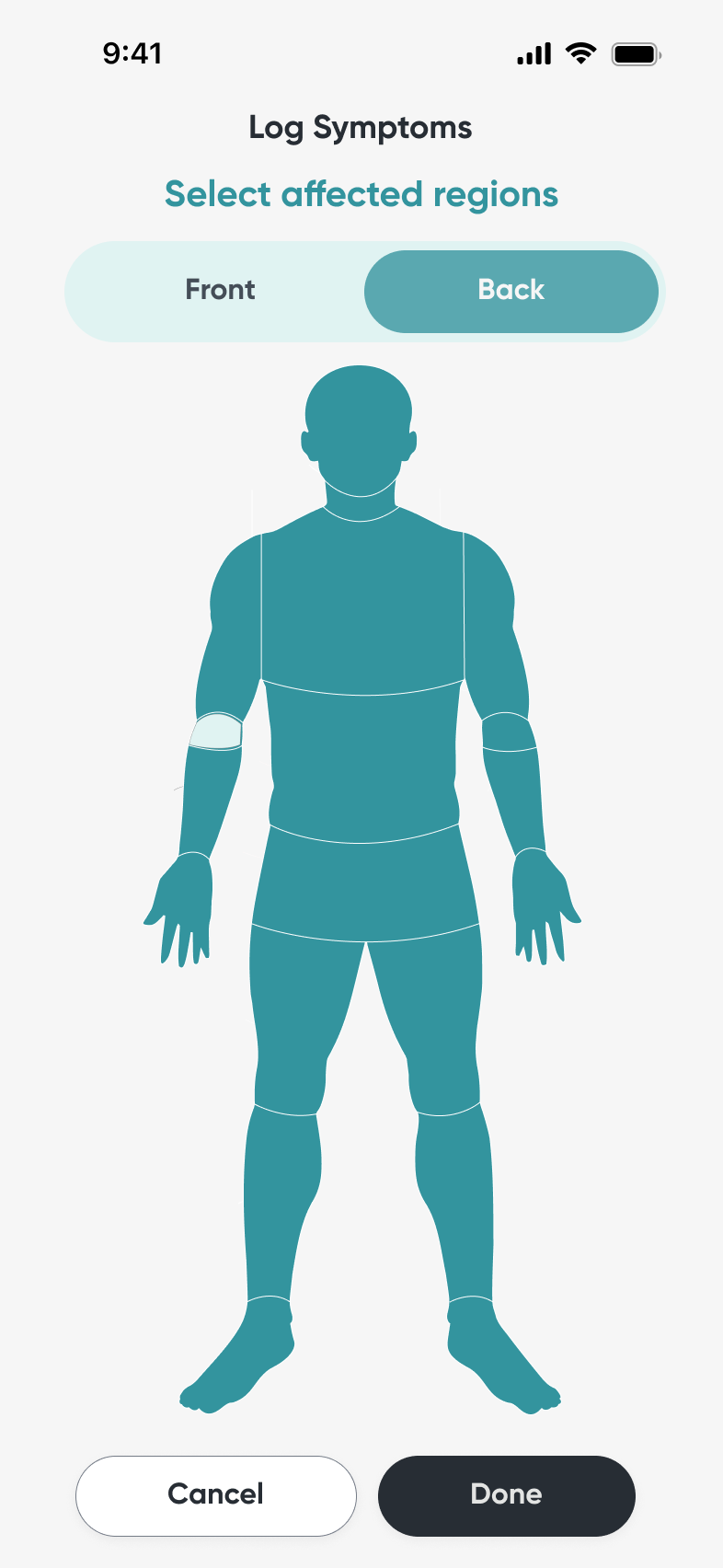
‘Front’ and ‘Back’ buttons could be read as ‘Next’ and ‘Previous’, confusing users.
‘Cancel’ and ‘Done’ at the bottom, with front and back views as tabs at the top.
05Proof
Heuristics weren’t enough, so we asked experts
Nielsen’s heuristics are broad and don’t cover accessibility or assistive technology. So we triangulated: the revised prototype went to Christopher Ferguson, founder of Bridgeable and a healthcare design expert, and to our research coach, Alexandra Watral, PhD.
- Represent every body. One “muscular” body model doesn’t reflect the whole population.Expert feedback
- Ground insights in clinical guidelines. Personal data is valuable, but it needs a clinical frame, and more doctors in the loop.Expert feedback
- Say why we’re asking. Explain the purpose of tracking during onboarding and on the symptom log.Expert feedback
06In their hands
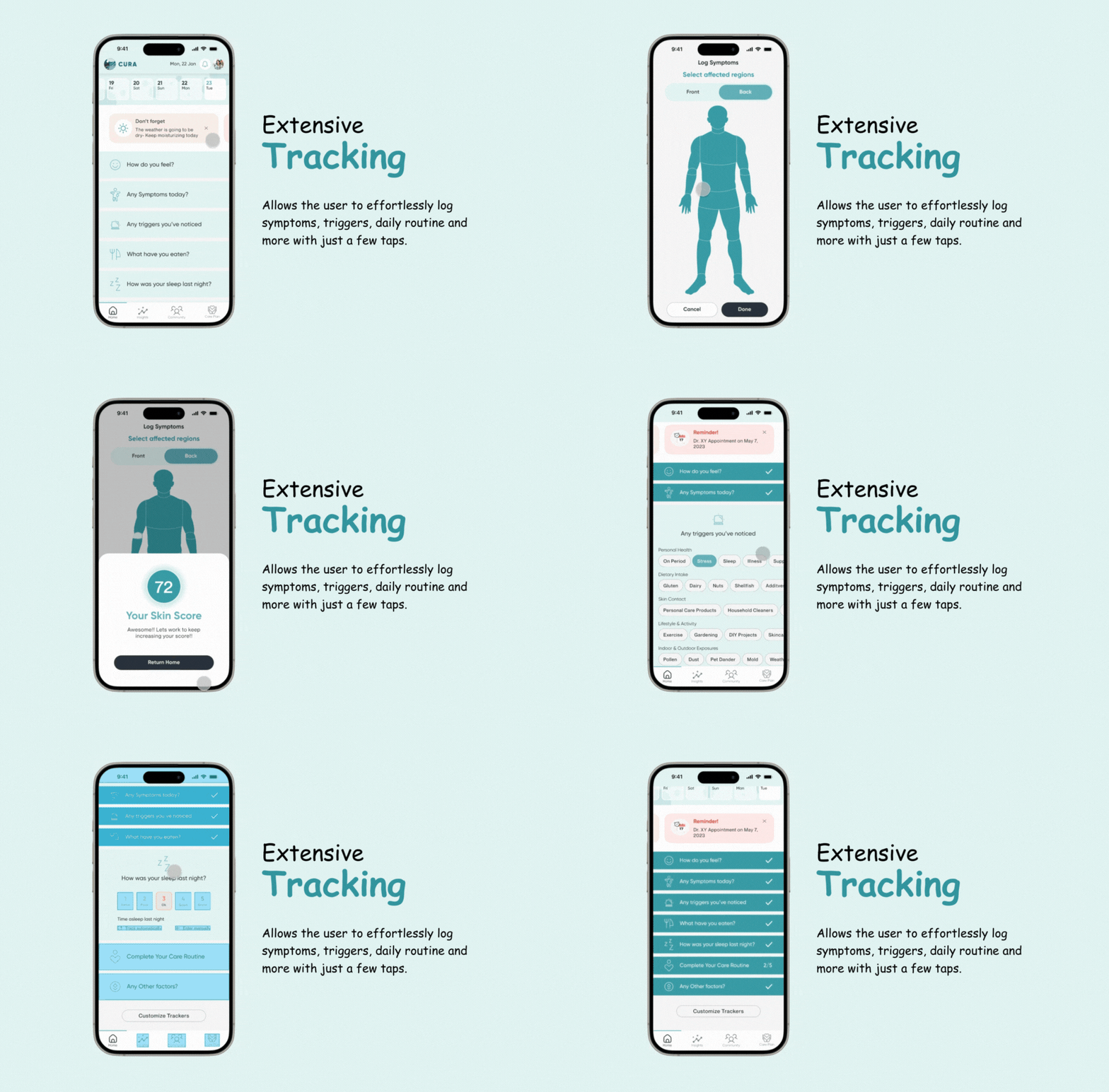
Meet Cura
The final concept, as we presented it in Chicago.
07The new reality
2ndplace at the HFES mHealth App Competition in Chicago.
- 80
- Reddit threads coded into themes
- 3
- expert reviews: a dermatologist, a healthcare design founder and a research coach
Cura brings tracking, pattern-finding, alerts, care plans and doctor-ready reports into one app, built on Human Factors Ergonomics principles from the first wireframe.
08What I took away
- Bring experts in early. Working with a dermatologist showed me how much earlier expert input shapes a user-centred health product.
- Validation builds trust. Expert feedback kept the app medically accurate, and that credibility is what makes people rely on a health tool.
- Small choices, big usability. Font sizes and touch-friendly buttons did more for accessibility than any single feature.